Product Design

Claro pay start

Real banking autonomy with parental oversight that builds trust, not surveillance.

Year:

2022-2023

Industry:

Finance

Client:

Claro

Project duration:

10 months

Two smartphone mockups displaying the Shell Box app interface. Left screen shows personalized greeting, yellow payment button, and promotional banner. Right screen displays carbon footprint of 456 kilograms of CO₂ annually with visual equivalents and button to understand the calculation.

Overview

In Brazil, 71% of young people lack financial education. Existing digital tools oversimplified or lacked depth, achieving only 12% retention after 30 days.

Claro pay start combines gamification with real banking (Pix, cards, accounts) to teach financial literacy across developmental stages, ages 4-17.

MY ROLE

Lead UX/UI Designer across research, strategy, content, and interface design.

Mockup of three screens from a kids financial app. The first screen shows the Claro Pay Start onboarding with an educational illustration and a continue button. The second displays the account dashboard with balance, earnings, financial actions, and shortcuts such as PIX and payments. The third presents the app theme selection screen with illustrated options and a confirmation button.

Context

THE LANDSCAPE

Making complex financial concepts comprehensible across ages 4-17 with different developmental stages.

  • Parents feared surveillance would damage trust yet needed oversight of real transactions

  • Gamification must teach, not trivialize financial concepts

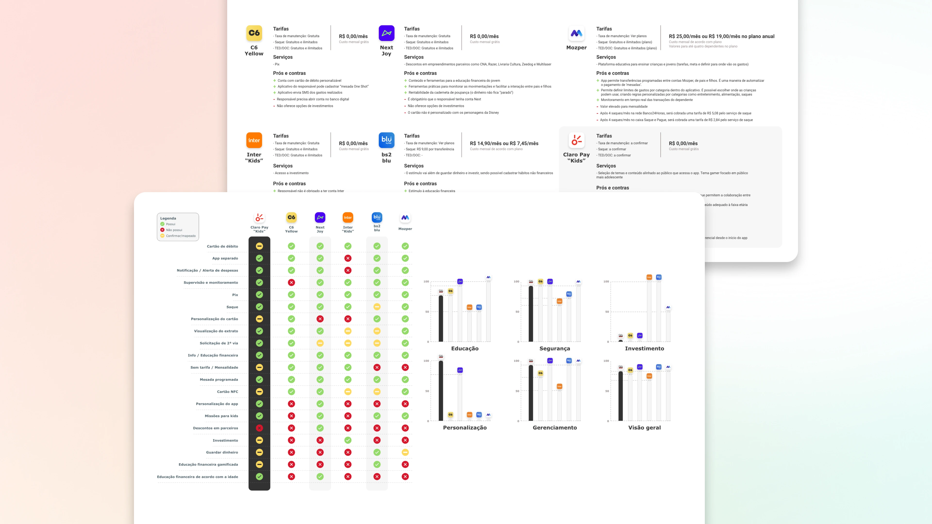
  • Integrate Pix, cards, and accounts safely across all age groups

RESEARCH INSIGHTS

Research with 24 parents and 32 children/teens revealed three insights:

  1. Developmental gap matters. Children need immediate visual rewards and simple language. Teens need real autonomy and reject playful aesthetics. One-size-fits-all fails both.

  2. Trust requires transparency, not surveillance. Parents need gradual control as children mature, but constant monitoring damages family trust.

  3. Learning needs context. Users learn by doing, not through disconnected theory. Every transaction becomes a teaching moment.

Comparative dashboard of kids financial products in the Brazilian market. The image displays tables with pricing, services, pros and cons, along with a feature comparison matrix across different apps. Supporting charts visualize criteria such as financial education, security, investment, personalization, and overall coverage.

The solution

STRATEGIC DECISIONS

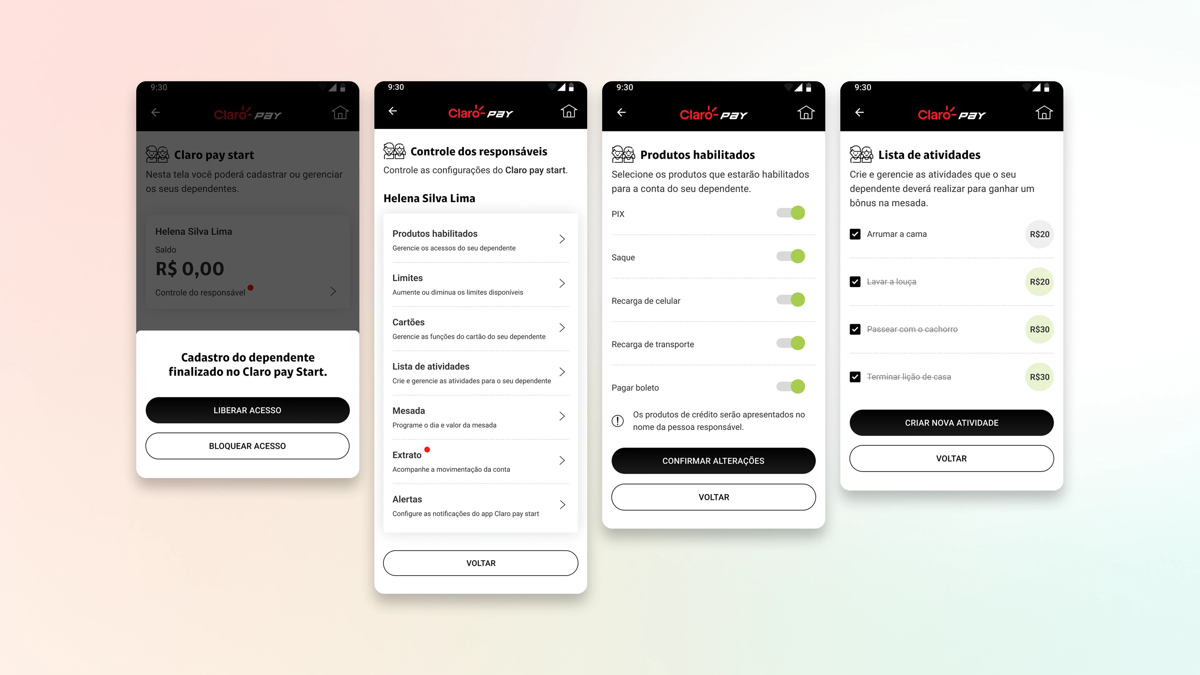
Age-adaptive architecture. Distinct interfaces scale with developmental stages. Children get visual rewards and simplified language. Teens get direct controls and customization.

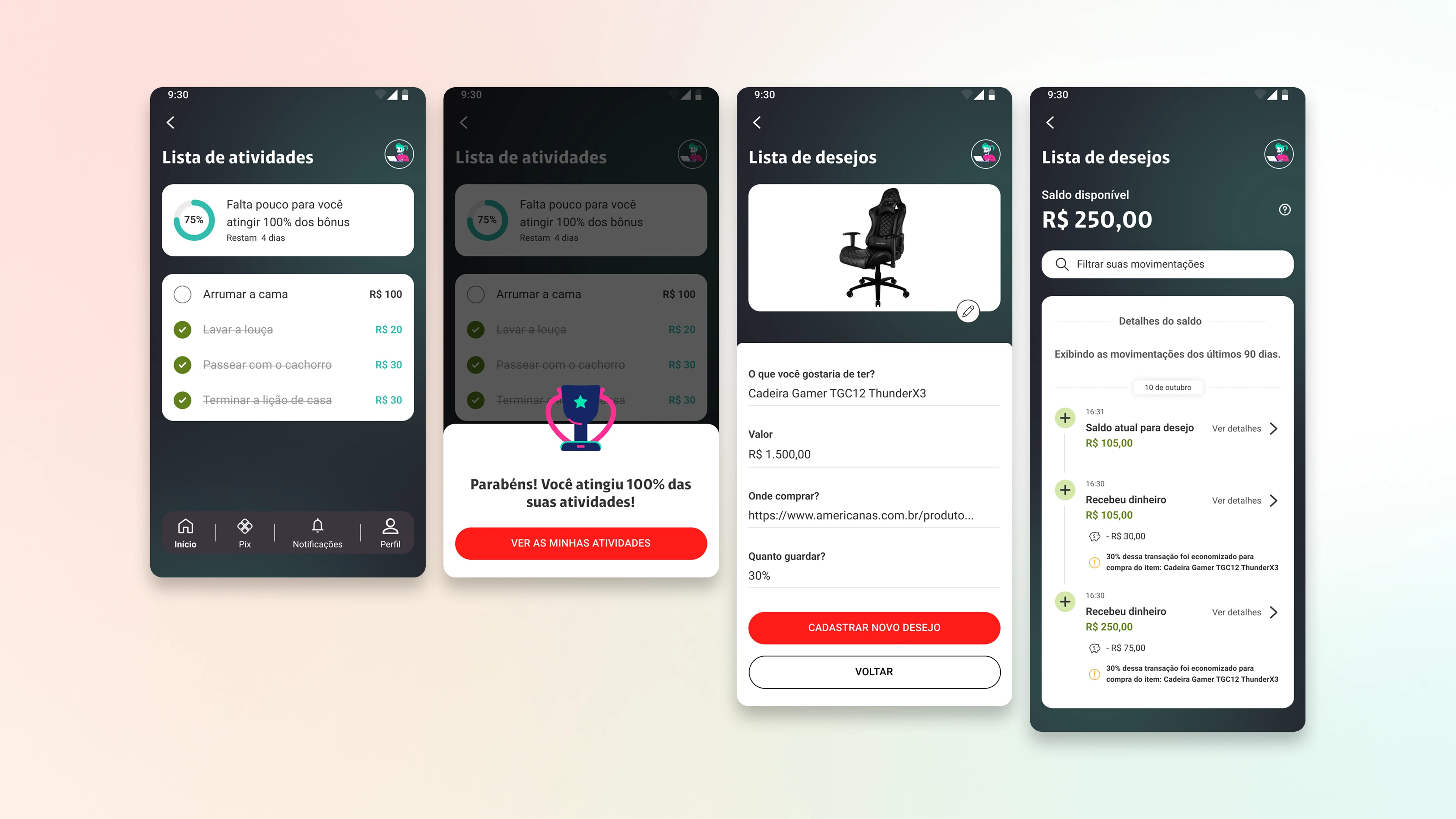
Progressive education system. Five age-adapted levels: Save → Set Goals → Invest → Avoid Waste → Share. Each level connects actionable challenges to real transactions.

Trust-based parental controls. Initial prototype sent push notifications for every transaction. Testing feedback: "This feels like spying." Pivoted to opt-in dashboard with transaction overview, not surveillance. Controls scale with child maturity.

Genuine rewards over empty badges. Claro ecosystem benefits (streaming vouchers, cloud storage, gaming discounts) reinforce education and create cross-sell opportunities.

CORE FEATURES

  • Pix flow with 4 visual options and educational tooltips

  • Goals with visual progress (illustrations fill as savings grow)

  • Parental dashboard: transaction history and spending insights

  • Dual challenges: active and historical achievements

MVP (MINIMUM VIABLE PRODUCT)

  • Onboarding with age verification and parental setup

  • Pix transfers with educational tooltips

  • First 2 educational levels with foundational challenges

  • Parental dashboard with transaction history

  • Goals with visual progress tracking

Onboarding sequence with four mobile-format cards. Each card features nature-related background images (sky, mountain, ocean, forest) with dark gradient, motivational texts about environmental impact, and skip button. Last card has green action button "Let's go".
Four-screen app flow showing the carbon footprint calculation process. First screen displays loading with green icon. Second and third screens present the result of 456 kilograms of CO₂ with visual comparisons. Fourth screen details the Neutral Carbon Ethanol program with leaf image and explanation of how it works.

Key Learnings

Education cannot be cosmetic. Badge systems felt hollow in testing. Users valued challenges only when tied to genuine content and tangible benefits. Gamification without substance backfires."

Parents want oversight, not surveillance. Constant notifications felt invasive. Opt-in dashboard increased trust and acceptance without children feeling watched.

Language shapes financial stigma. Microcopy testing: "Ask for money" outperformed "Request allowance" 2x (less formal). "Your money is growing" beat "150% CDI yield" by prioritizing comprehension over technical accuracy.

Narrative transforms gamification. "Make 5 Pix transfers" had low completion. Reframed as "Social network fan: share 1 achievement" increased completion 38%.

Adaptation scales with maturity. Treating 4-year-olds and 17-year-olds identically fails both. Success required adaptive language, progressive complexity, and personalization giving teens interface control.

Set of four screens showing detailed carbon footprint analysis. First screen with comparative bar graphs. Second with donut chart showing distribution among regular gasoline, premium, and ethanol. Third displays green highlight with "80% less CO₂ than gasoline" and Ethanol logo. Fourth presents information about the Envira Amazônia project with community photo.
Gamification interface with four screens. First and second show progress at Level 1 with plant icon, 500 experience points, and "First step" challenge 100% completed. Third and fourth screens display challenge to fuel five times with ethanol, showing 0% progress and 5 remaining refuelings, plus "Learn more" section with informative cards.

Expected Outcomes

QUANTITATIVE IMPACT (Internal Testing + Pilot)

  • 87% parental approval on controls and transparency (target: 75%)

  • 43% increase in 60-day retention vs. 12% market average

  • 5.2 challenges completed per active user in first month

  • 72% reached Level 2 within 45 days (expected: 50%)

  • 89% satisfaction on Pix transaction usability

  • NPS 4.6/5 among young users vs. 3.8 market average

BUSINESS IMPACT

Positioned Claro as Brazil's educational fintech pioneer, driving 23% parent conversion to full accounts. First Brazilian solution combining gamification, real banking, education, and parental supervision.

BEHAVIORAL CHANGE

Parents reported unprompted questions about interest rates and investment. 31% reduction in blocked transactions showed users learning limits, not testing boundaries.